In this post I’m going to talk about the basics of visually appealing content, AKA the perfect Instagram feed and how to achieve it. You likely follow many accounts that have a huge following. What do they all have in common? All of their pages have a theme, whether it be travel, fashion, food, etc. However it doesn’t just stop there. There is usually a color scheme or pattern to their posts.
Some examples of this would be:
- All monochromatic photos
- Low or high contrast photos
- Photos with very little contrast
- Every other photo being a picture of nature, a landscape/skyline, or quote
- A color scheme (teal and orange, blue and brown, washed out neutrals)
Here are some examples of different types of visually appealing themes
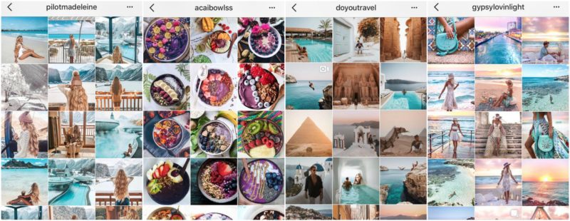

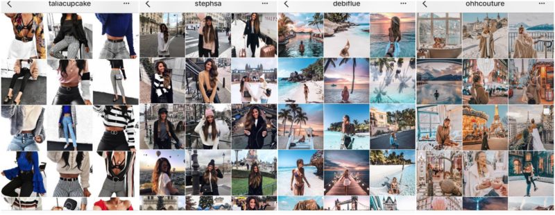
These are a few of my favorite accounts that I currently follow on Instagram. As you can see, they each have their own theme, pattern, and color scheme. Choosing a theme and sticking with it can be hard, but this will also help you gain more activity on your page. People judge whether or not they want to engage or follow you within the first 5 seconds of browsing your feed. If it looks sloppy or all over the place, you likely won’t see much activity. Obviously you don’t have to do this, and there are plenty of accounts that don’t. I personally just prefer to scroll through an organized feed.
Although many of these people use a fancy camera and editing software, you don’t necessarily need all that to achieve a similar look. All you need are a few basic things.
- Natural lighting or a ring light with a camera/phone mount if you want to get fancy
- A smart phone (the newer the model the better camera quality obviously)
- Photo editing apps
Snapseed app | VSCO app | Afterlight app | Lightroom app

Here is an example of a picture I took with my iPhone edited in an app vs edited in Lightroom software
Snapseed & Lightoom App Edited | Raw Image | Lightroom Software Edited

I actually like the outcome on both of these photos. However the one on the left is a little too grainy. The more filters your put your image through, the more pixilated it becomes. I personally prefer smoother, crisper images. Although that is personal preference, I notice many of the accounts I follow use a lot of grain in their photos.
Here is an example of a picture I took with my canon edited in an app vs edited in Lightroom software
Snapseed & Lightroom app Edited | Raw Image | Lightroom Software Edited

Now to be honest, I actually prefer the image on the left, which I edited via phone app. I love how the HDR filter turned out, it made the photo really pop. The image on the right came out nice as well, it’s a little less dramatic, and smoother.
I personally love using the Adobe Lightroom software because it offers such an array of editing options. You can also save your presets, meaning once you’ve edited an image exactly how you like, you can save that filter for future use. You will often notice that many travel bloggers actually sell these presets so that others can apply them to their own photos.
If you don’t have the budget for these types of software, you can see that the apps can work just as well. Snapseed will automatically save your previous edits so you can apply them to all of your photos. However, if you have a filter from a city image saved and try to apply that to a nature image, it will not look the same! Here are some examples of a tropical filter applied to other types of scenery.
Example of Same Filter on 3 Very Different Images

While the tropical filter preset I have saved in Lightroom works perfectly for the first photo, you can see the second is too saturated and the third is too dark.
Example of Same Filter on 3 Similar Images

Although these are not all beach photos, the color scheme in the beginning was similar. Designing a filter based on the type of photo is key. This is the “tropical addicted” preset I saved in Lightroom, and as you can see it works well with beach photos and images with a lot of blues, greens, and yellows in them. I have presets saved for a variety of pictures including beach, city, and landscape photos. Some work great on different types of images, and some do not. Like I said, it all depends on the original color scheme of your picture.
This is how you can achieve a cohesive feed, by using the same or similar filters on each of your photos. Obviously it will be a little trickier if you are like me and have beach, city and fashion photography on your page. In this case I recommend tweaking each filter a bit to make them all similar. The best way to do this is decide if you want warmer tones or cooler tones, higher contrast or lower contrast. I tend to gravitate towards high contrast images (as seen above), although I’m learning to love the lighter images as well. Even with these techniques, my Instagram feed is still far from perfect! However, once you get the hang of it you may even notice that you are gaining more followers and likes. Also a little tip, by nature humans are attracted to symmetry, so make sure you keep those horizon lines straight! 😀

Instagram is a visual story of your life, so why not make it perfect?
Xx Alya